Posts
Working within the System
This is just a quick note to say that I’ve taken a post as the Systems and Discovery Librarian at the University of Georgia Libraries. There I’m going to help keep the figurative lights on as we work towards our big migration to the FOLIO library system.
Thankfully, we’ll have lots of help, as we’re making this move in conjunction with all of our friends at GALILEO Interconnected Libraries.
Needless to say, there will be less PubMed posting than before as I step aside from #MedLibs, but I will continue to work on the tools that I’ve developed as part of the Visualizing PubMed Project.
– ❉ –
Goodbye Mapping Tester!
As the NCBI has updated the eutils API to point to the current version of PubMed, including the most recent version of Automatic Term Mapping, there is no longer any access to ‘old’ PubMed.
Therefore, Mapping Tester is now defunct, though it’s code is archived at: https://github.com/esperr/mapping-tester
– ❉ –
Introducing Mapping Tester!
The newest version of PubMed has brought a lot of changes, including the ‘Best Match’ results sort. Another, less obvious change, is an update to how Automatic Term Mapping (ATM) works in the new version. Sometimes the ‘new’ mapping is exactly the same as the ‘old’, but sometimes it’s different enough to lead to noticeable changes in a search strategy that was developed before the switchover. Now thanks to an API from we can test and see for sure!
The production version of the eutils API points to ‘old’ PubMed, including the older version of ATM, but there is now a test server that uses the new ATM mapping (and also lets us get “Best Match’ sorting programmatically). Since we have both the ‘old’ version of the API as well as the new one, that makes it possible to run the same search against both, and see if there are any differences. A little bit of JavaScript, and et voilà! https://esperr.github.io/mapping-tester
There are many cases where the mapping is exactly the same, such as with “viral infection”:

In other cases, as with “influenza”, the new mapping algorithm includes a plural form or synonym that makes a significant difference (in this case, 21% greater retrieval):

In some cases, the differences are so radical that it seems that they must have been intentionally hand-tweaked. In this case, there is a lot (7.5x more) captured by the new mapping for “diabetes medication” that was missing before:
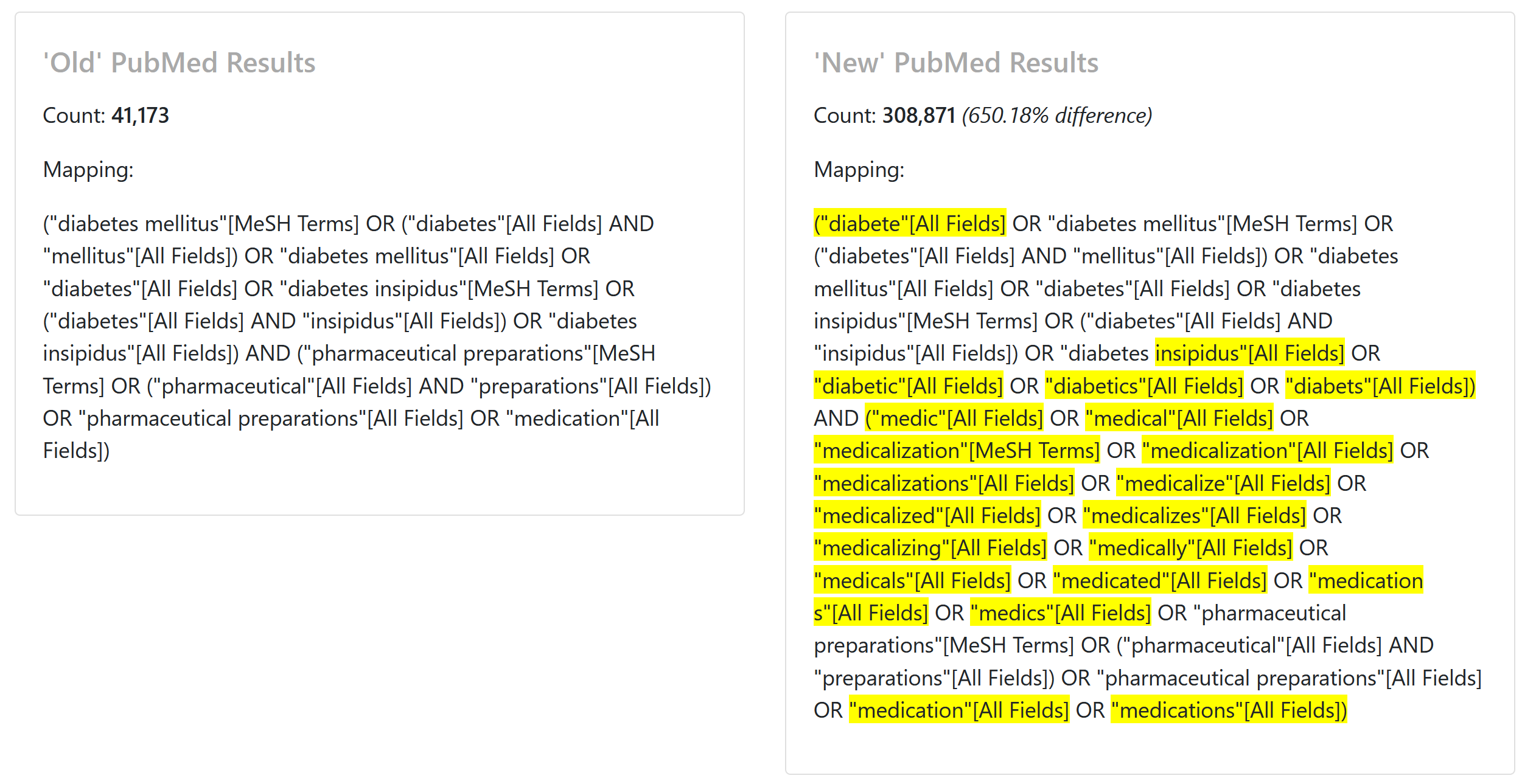
So does this mark a conscious effort to increase retrieval for a beginner-level search for medications? It certainly seems deliberate. Indeed, I imagine some sort of user testing by the friendly folks on the PubMed UX team was involved. This is the sort of change that is very dramatic, but shouldn’t affect the more complex, fielded searches done by a medical librarian (as they are less subject to modification by ATM in the first place). But as advanced PubMed users know, ATM can be…persistent, so it may be worth checking a recurring search that you developed before the handover to ‘new’ PubMed using https://esperr.github.io/mapping-tester.
If you find any particularly interesting differences, let me know!
– ❉ –
Introducing Collection View!
A few days back, I had the distinct pleasure of debuting my newest project, Collection View, at my talk “Looking Beyond the List: Enhancing Search with Interactive Visualizations” at Code4Lib 2021. You can find the slides for that talk at osf and the recording on YouTube.
One issue with large bibliographic databases is that many searches return hundreds if not thousands of results. Ideally, much of what a user is looking for will be concentrated in the first few dozen results, as those are likely the only results they will ever look at. Otherwise that user should revise their search, but how do they know if those changes are doing any good?
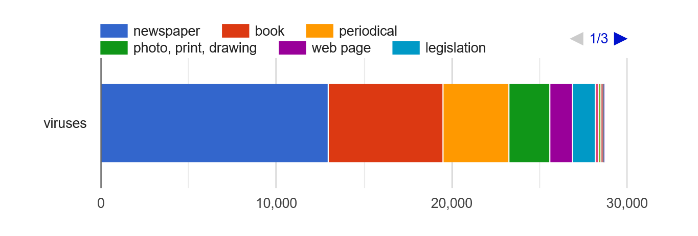
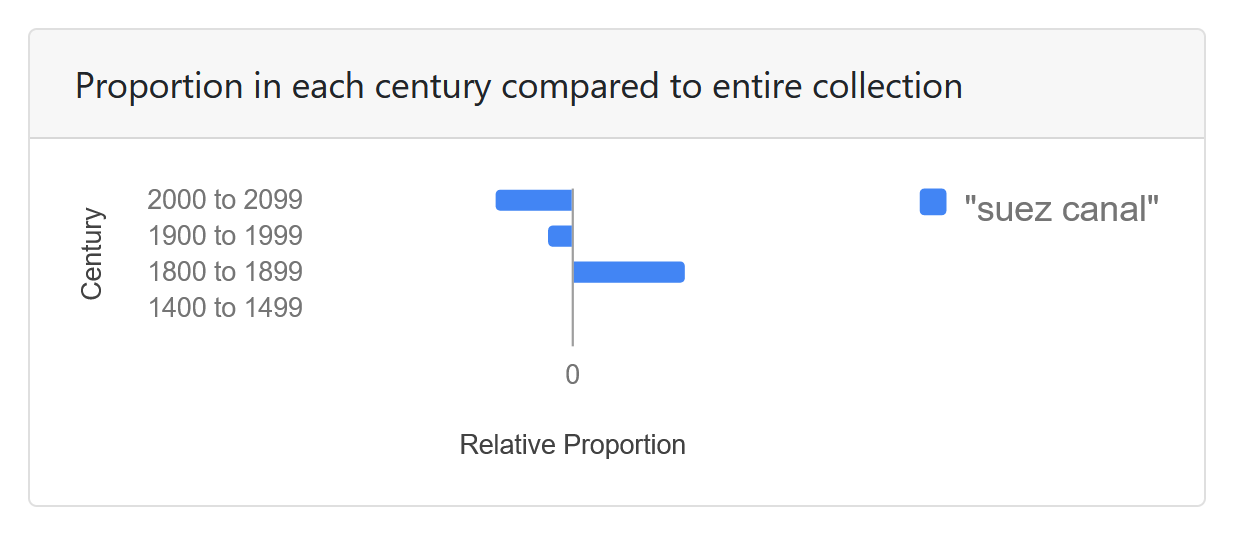
Here is where visualizations can help! Collection View is designed to translate your Library of Congress search into simple visualizations that give you an instant summary of the kinds of materials that are being returned as well as showing how their proportions compare to those of the collection as a whole.
Much like Search Workbench, it also uses Venn diagrams to illustrate how parts of complex search relate to one another. For example, if someone were to search using Boolean logic for “Art Nouveau AND furniture”:
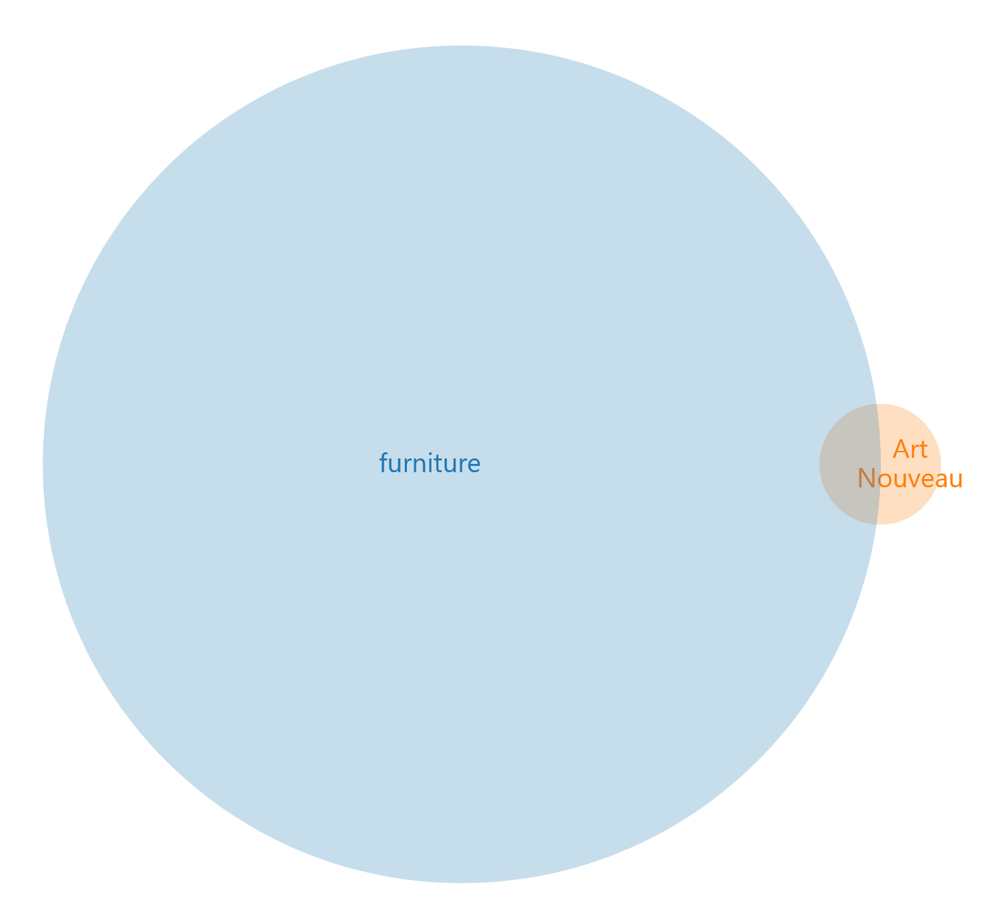
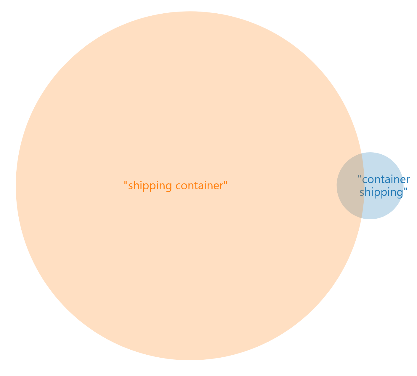
Crucially, it also (as Search Workbench does) allows you to visually compare multiple searches to one another, facilitating the process of refining a complex search strategy. For example, the results returned by the search “container shipping” are not at all the same as those found with “shipping container”:
Collection View uses the Library of Congress API maintained by LC Labs, so any search that runs against their database can be visualized! As always, let me know if you have any questions or comments.
– ❉ –
Call for Collaborators: Testing Covid-19 Hedges
There are a number of publicly available search strategies for finding Covid-19 related literature in PubMed, but there’s not a lot of information about how well they work. Let’s fix that by testing them!
In this project, we’ll use some of the same concepts that I developed in an earlier project to randomly generate a set of citations to appraise for fitness to purpose. Once we’ve collaboratively developed some validation sets of “good” items, we can use them to evaluate the different hedges we’ll be testing.
I’m putting together a conference proposal right now, so let me know ASAP if you want to participate by emailing me at esperr@uga.edu.
– ❉ –
