Visualizing PubMed
Rationale
PubMed is an invaluable resource, enabling searching of a large portion of the biomedical literature and serving as perhaps the most popular entry point to MEDLINE. As an interface however, it is primarily geared towards presenting results in the form of a long, paginated list. This works well for examining individual citations, but is a poor fit for getting a larger sense of how one search compares to another (or how the results of a particular search compare to the database as a whole). For this purpose, it would be better to see searches in aggregate. Even better would be to display and compare searches using a variety of criteria.
Methods
Using the NCBI API (E-utilities), I have developed a series of tools to visualize PubMed searches. Querying of the API and parsing of the results is done in the browser via JavaScript and the jQuery library. Visualization of results is also done in the browser (for the most part with Google Charts and with the venn.js overlay of d3.js for Venn diagrams).
Results
PubTrees
PubTrees (https://esperr.github.io/pub-trees/) enables you to explore the concepts in the documents returned by your PubMed search by using the Word Tree technique first developed by Martin Wattenberg and Fernanda B. Viégas. Much like word clouds, Word Trees provide information about the frequency of terms. Crucially, they also reveal the context in which those terms are used by showing the frequency of word sequences.
Search Workbench
Search Workbench (https://searchworkbench.info/) is a workspace for visualizing individual searches as well as making visual comparisons between different results sets. This tool enables you to easily see how changes in your search strategy affect your results in real time. The goal is to streamline the process of refining a search so that you can spend less time dialing-in your search strategy and more time examining your results.
PubMed by Year
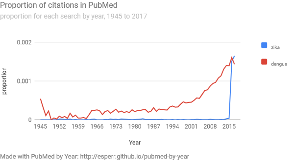
PubMed by Year (https://esperr.github.io/pubmed-by-year/) shows your search on a line chart, comparing the results for each year to the database as whole. We use proportions instead of raw numbers, as the the astonishing increase of the biomedical literature over time makes a bare count less illustrative of changes for any given search. Helpfully, you can add additional searches so you can directly compare how different topics have been treated over time.
Note: As PubMed by Year uses the “Results by Year” CSV file generated by PubMed, it does not work for searches that return fewer than 500 total results (because that file doesn’t get generated for smaller result sets).
PubVenn
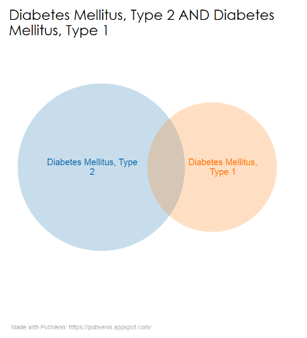
Venn diagrams have been used by librarians for ages to help users visualize how complex searches work. PubVenn (https://pubvenn.appspot.com/) takes a complex PubMed search and divides it into its constituent parts. It then searches those disparate parts and shows the piles of citations they return using a proportionally-sized venn diagram.
Searches can be simple or complex, though plotting intersections onto a two-dimensional plane can be somewhat inexact for any diagram involving more than two sets.
MeSH Category Graph
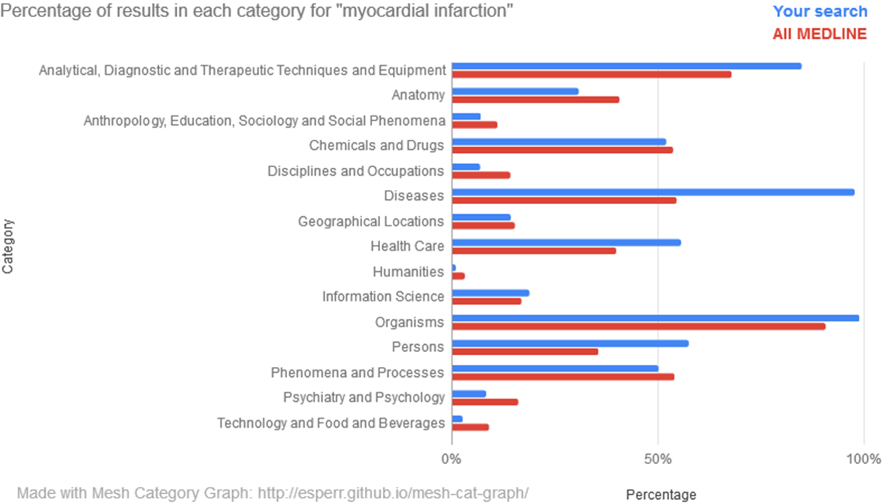
MeSH Category Graph (https://esperr.github.io/mesh-cat-graph/) Graphs a search against the the 16 top-level categories in the MeSH hierarchy. For each search you’ll see two graphs — one showing percentages compared to those for all of MEDLINE and another showing relative proportion.
Once you have completed at least two searches, you can compare the proportions of one search against another.
MeSH Subheading Graph
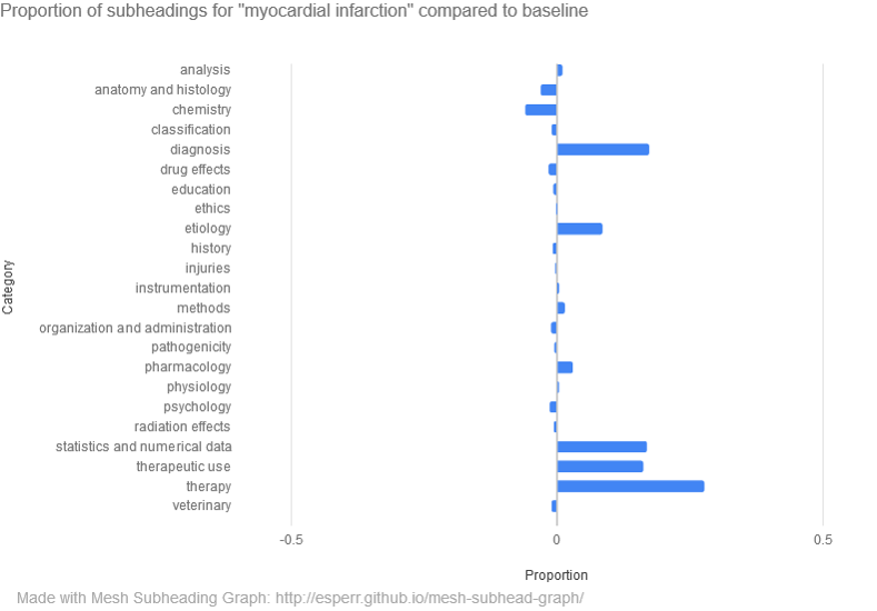
MeSH Subheading Graph (https://esperr.github.io/mesh-subhead-graph/) Graphs a search against the 23 top-level subheadings (“analysis”, “physiology”, etc.) in the MeSH qualifier hierarchy. As above, results are displayed in two ways, and any two searches can be compared with one another.
Mapping MEDLINE
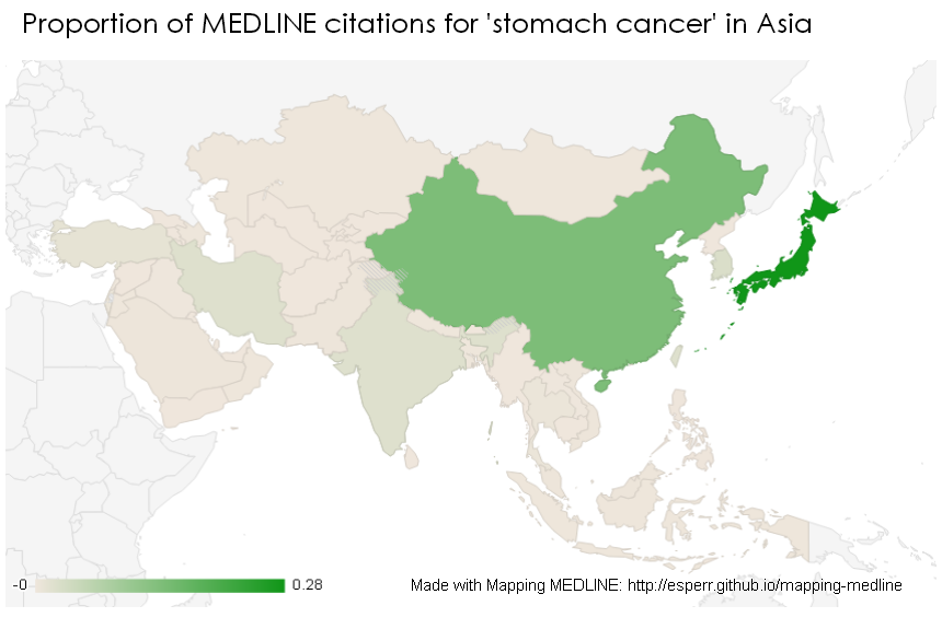
MeSH headings include not only topic areas but geographic regions — around 15% of all indexed records are tagged with the name of a continent, country or city. Mapping MEDLINE (https://esperr.github.io/mapping-medline/) searches your results against these geographical headings. Of course some articles might mention a country name in a title or abstract without a corresponding index term, so Mapping MEDLINE searches those fields by country name as well. Results are displayed as a choropleth map (shaded by proportion) in order to better reflect regional variation.
You can find the source code for each of these applications at github/esperr