Plotting Ideology vs Engagement
Introducing a new visualization in Members by Interest – scatter plots that show the relationship between a member’s engagement with a given topic (as measured by adjusted score) and their ideology (as measured by Dimension 1 DW-NOMINATE scores).
As noted before, adjusted scores measure a member’s interest in a given topic as reflected by those measures about that topic (as cataloged by the folks at LC) that they sponsor and cosponsor. These scores are the same ones that drive the existing visualizations where members are ranked by the intensity of their legislative interests. What’s new with visualization is the incorporation of DW-NOMINATE scores.
The Dynamic Weighted NOMINAl Three-step Estimation metric was pioneered by Keith T. Poole and Howard Rosenthal at Carnegie-Mellon University. The system they developed plots members along axes of “left” and “right” (the Dimension 1 used in this visualization) and other pressing issues of the day (Dimension 2). This plotting is based on comparing roll call votes to one another and is further described in Poole’s Spatial Models of Parliamentary Voting.
As with the ranked view, users can examine data for both Policy Areas and Legislative Subject Terms. Unlike the ranked view, users will be limited to viewing results for an individual congress (DW-NOMINATE scores for the same member may vary by congress).
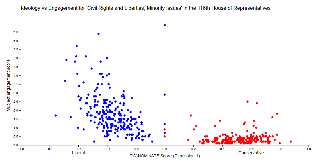
Sometimes there are strong correlations between ideology and subject engagement, as with the Policy “Civil Rights and Liberties, Minority Issues”:
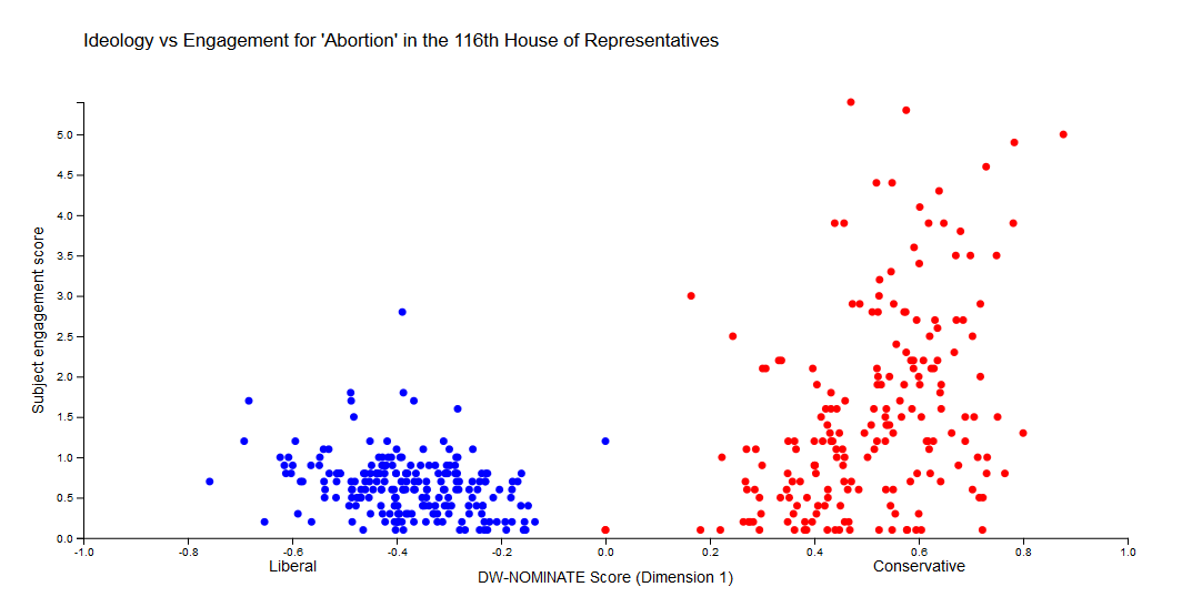
…or the Legislative Subject “Abortion”:
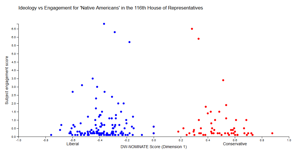
In other cases there seems to be little obvious relationship between engagement and ideology, as with “Native Americans”:
If you hover over a point, you see the member in question, as well as how many measures she has sponsored and cosponsored about that topic.
As always, contact me if you have any questions or suggestions.